Why Most Online Surveys Fail (and How We Fixed It)
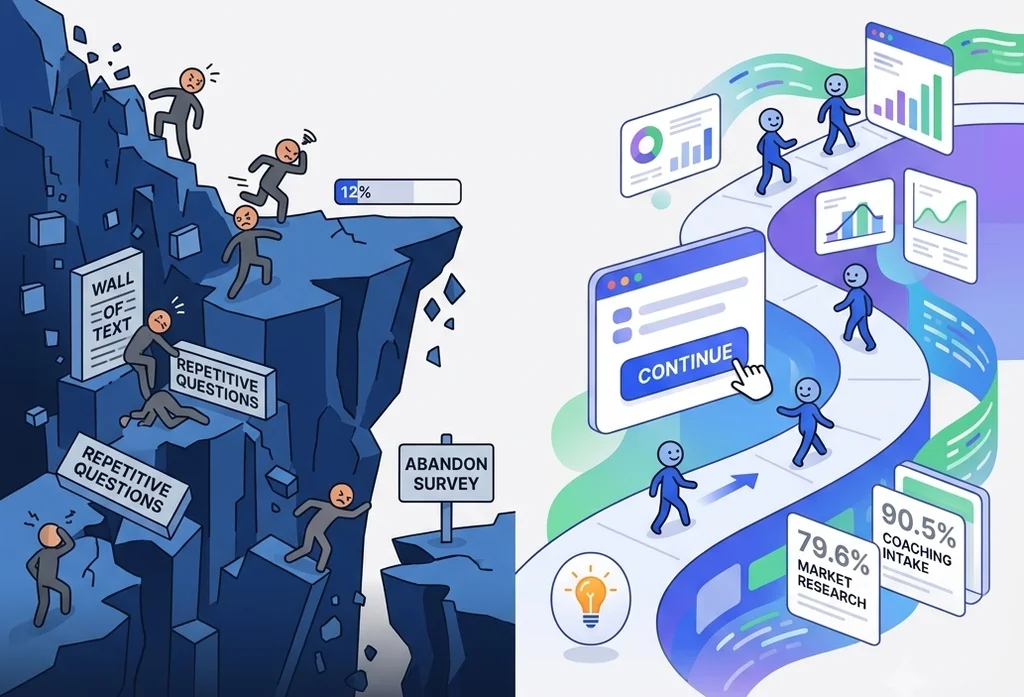
We’ve all been there. You click a link to share your feedback or take a quick assessment, only to be met with endless blocks of copy, redundant form fields, and a progress bar that seems stuck at 12% forever.
What do you do? You close the tab.
In the tech and research space, this is known as the "Friction Cliff"—the exact moment a user’s patience runs out and they abandon a form entirely. Industry-wide, online surveys are plagued by abysmal completion rates, often hovering somewhere between a dismal 20% and 50%. Most platforms simply accept this as an unavoidable cost of doing business.
At Engage Hill, we didn't want to accept it. We decided to fix it.
To see exactly how our frameworks perform under the hood, we pulled and analyzed our platform data from the past few years. After cleaning the datasets to isolate true user engagement from automated system events (like screenouts and full quotas), the actual human completion metrics came to light.
Here is what the numbers look like.
Market Research: An Elite 79.6% True Completion Rate
To benchmark this engineering under the hood, we analyzed several years of platform history. After filtering the dataset to isolate true user engagement from automated system events (like screenouts and full quotas), the performance metrics for our qualified market research panels speak for themselves:
- Eligible Starters: 13,299
- Successful Completions: 10,597
- True Organic Completion Rate: 79.68%
This is the foundation behind Colormind’s superior consumer insights. An 80% completion rate in cold market research is an elite-tier metric. It proves that once a user is qualified, our user interface is smooth, fast, and intuitive enough to keep 4 out of 5 people moving forward until the very last click.
Coaching & Development: Reaching 90.5% Retention
We also looked at the data for intake assessments and onboarding workflows within our professional coaching and personal development modules.
This is where user psychology completely shifts. While research panel participants are often driven by external incentives, coaching clients possess intense internal motivation. They are filling out forms to prepare for self-improvement or to kick off an enterprise development program.
When technology aligns perfectly with a highly motivated user, drop-offs virtually vanish. Our analysis of the coaching dataset showed:
- Total Onboarding Starters: 7,439
- Completed Intakes: 6,733
- True Coaching Completion Rate: 90.51%
Losing fewer than 10% of users during a comprehensive intake process is a gold-standard metric for businesses and MindsetView users. It means coaches using our system aren't losing leads to clunky paperwork, and enterprise HR teams are maximizing their program ROI from day one.
The Real Secret: Color Response Mapping
While high user motivation explains why coaching metrics skew so high, it doesn't fully account for how we pushed cold market research completion rates to nearly 80%. The real driver behind these numbers is a core platform mechanism we engineered called Color Response Mapping.
Traditional survey platforms treat forms as static text fields—monotone, clinical, and mentally exhausting. Color Response Mapping transforms data collection into a dynamic, sensory experience. By assigning intuitive colors to interactive elements, we align the interface with how the human brain naturally processes information.
Instead of forcing a respondent to read and re-read dense labels, the UI uses colors to establish instant contextual meaning. This drastically lowers cognitive fatigue, keeps the user's focus locked, and maintains an unbroken momentum from the first question to the last click. It turns out, when you change how a survey looks and feels, you fundamentally change how users respond to it.
How We Fixed the Friction Problem
Achieving an 80% research rate and a 90.5% coaching retention rate wasn't an accident. We intentionally engineered our data collection system to combat survey fatigue in three distinct ways:
1. Eliminating Micro-Friction Across Every Device
Every extra second a user spends navigating an interface on a desktop or fumbling with small inputs on a smartphone increases the chance they will quit. We meticulously engineered our layouts around cross-device, ergonomic ease of use. Whether a respondent is clicking on a PC or tapping single-handedly on a phone, our responsive typography, seamless language selection, and highly tactile button states ensure the interface feels completely effortless—so the data flows effortlessly.
2. Pacing and Momentum
We track performance metrics closely. Across our platform, users average a rapid 6 seconds per topic. Our interactive data collectors keep cognitive load light, guiding the user organically through an assessment rather than overwhelming them with a mountain of input fields.
3. Continuous Quality Control and "Affected" Data Invalidation
A great data collection platform shouldn't just collect mass numbers; it needs to collect clean, actionable insights. Our engine aggressively filters out noise right at the front door using robust screening and quota-matching rules. But the cleanup doesn’t end there. In sensitive environments like professional coaching, we actively identify and disqualify unreliable responses. If an assessment's integrity is compromised or falls outside trusted response baselines, the platform flags and invalidates those "affected results"—preventing skewed data from reaching your dashboards and ensuring our B2B clients only analyze pristine, highly targeted datasets.
The Bottom Line
Most online surveys fail because they treat data collection as a sterile database requirement rather than a human experience.
Whether you are launching a massive consumer market research panel or managing sensitive client onboarding for an elite coaching firm, your completion rate is your bottom line. By respecting the user's time and optimizing the digital environment, we've proven that high engagement isn't just a goal—it's something you can actively build.
Want to experience a friction-free workflow for yourself? Try out our interactive data collection demo here and see why people actually finish. Can you beat our platform average?